
From Concept to Final: How a Brand Identity Comes Together
A strong brand identity rarely starts with a finished logo.
It usually starts much earlier, with questions, references, atmosphere and direction. Before the final colours, typography, layouts or mockups appear, there is a process of understanding what the brand should feel like and how it should be remembered.
Brand design is not just about making something look good. It is about creating a visual system that feels clear, consistent and connected to the brand behind it.
In my article on what makes a strong brand identity, I wrote about how a brand needs more than a logo to feel recognisable. This article looks at how that identity actually comes together, from the first concept to the final visual system.
A brand identity begins with direction before it becomes a visual system.
It starts with understanding the brand
Before any visual direction can be created, the brand needs context.
What does the business offer?
Who is it speaking to?
What should people feel when they experience it?
Where will the identity need to appear?
What should the brand avoid?
These questions shape the creative direction. A restaurant, a fashion brand, a consulting studio and a local service business all need different visual decisions. Even if they all want to feel premium, modern or timeless, those words can mean very different things depending on the brand.
This early stage is about finding the right foundation. Without it, the design process can easily become a collection of nice visuals without a clear reason behind them.
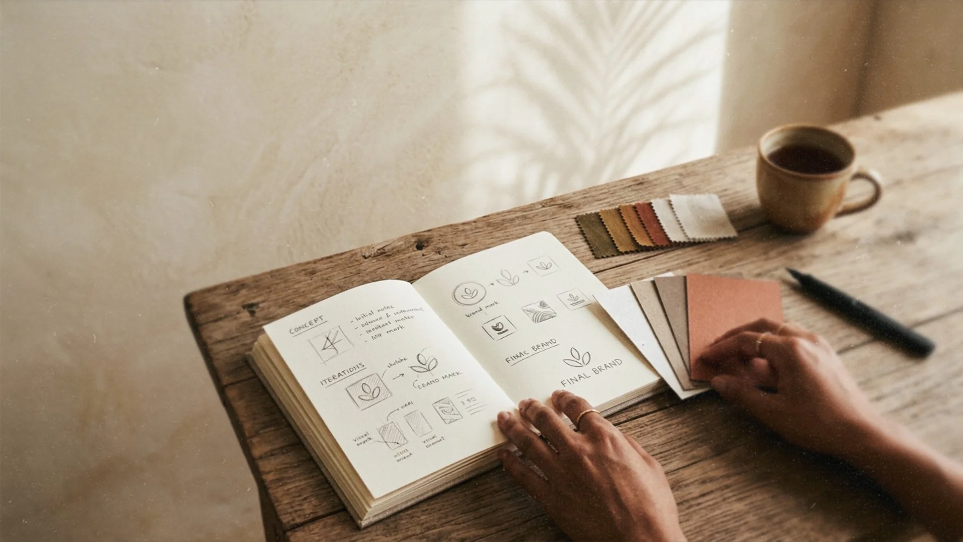
The concept sets the direction
Once the foundation is clear, the concept begins to take shape.
This is where mood, references, materials, colour, typography and atmosphere start to come together. The concept is not the final identity yet. It is the creative direction that guides everything that follows.
A good concept helps define what the brand should feel like before individual design elements are created.
It might be warm and tactile.
Quiet and editorial.
Bold and direct.
Clean and corporate.
Playful and nostalgic.
Minimal but full of detail.
The concept gives the identity a point of view.
This is also where art direction becomes important. As I wrote in my article on AI in brand design, more visual output does not automatically create a stronger brand. The value lies in knowing what fits, what does not, and why.
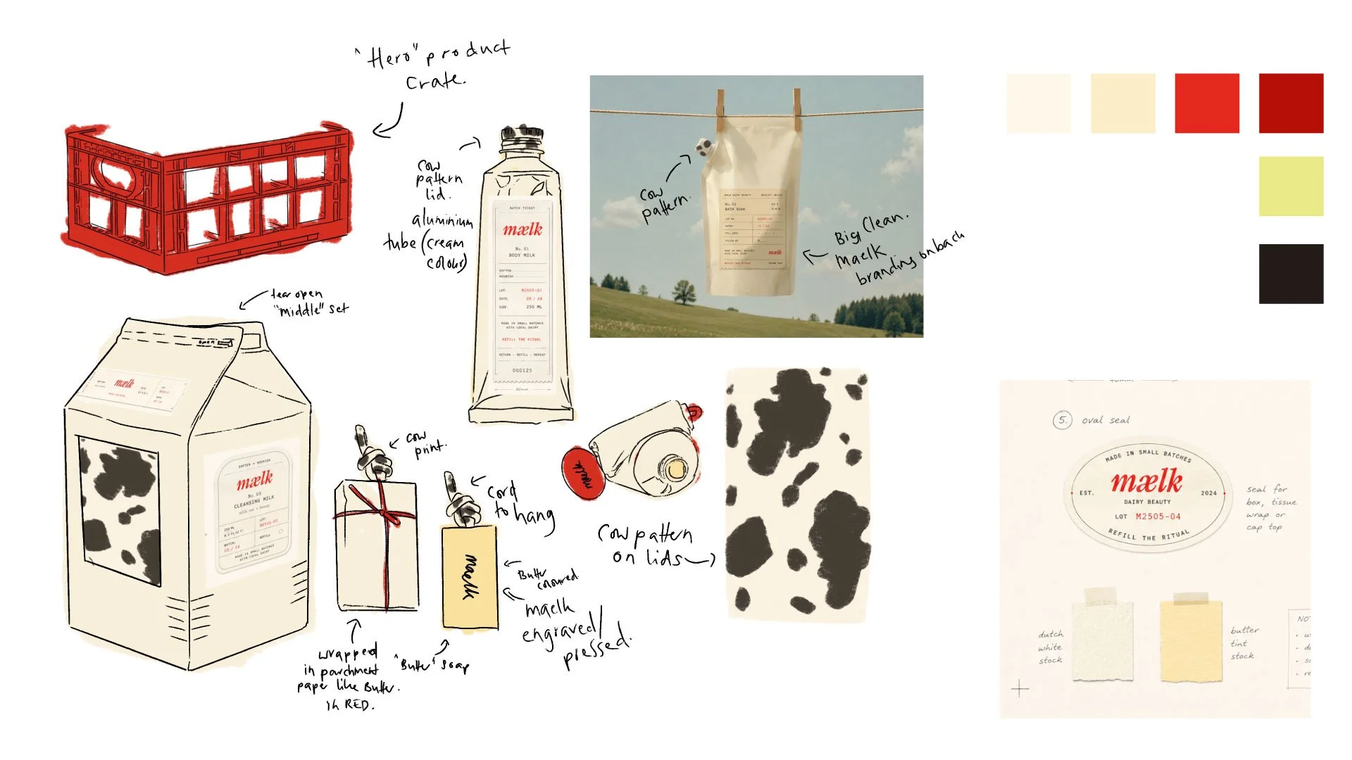
Early concept notes for Mælk, exploring packaging, materials and visual direction.
The logo is only one part of the identity
The logo is often the most visible part of a brand identity, but it is not the whole identity.
A strong logo should feel appropriate, memorable and usable across different formats. But it also needs to belong to a larger visual language.
That visual language includes typography, colour, imagery, layout, graphic elements, textures, spacing and tone. These pieces work together to create recognition over time.
A logo on its own can look beautiful, but if the rest of the brand does not support it, the identity can feel incomplete.
This is why the design process usually moves from individual elements into a full system.
The identity becomes a system
Once the core elements are defined, the brand identity starts to become practical.
This is where the design is tested across real touchpoints. A brand might need menus, packaging, social media templates, signage, website layouts, business cards, presentations, campaign graphics or printed material.
Each touchpoint should feel connected without looking exactly the same.
This is one of the most important parts of brand design. A strong identity has enough consistency to feel recognisable, but enough flexibility to stay alive.
The system should answer questions like:
How does the brand use colour?
What type of imagery feels right?
How much white space does it need?
How does it behave on social media?
How does it feel in print?
What details make it specific?
This is where a brand starts to feel real.
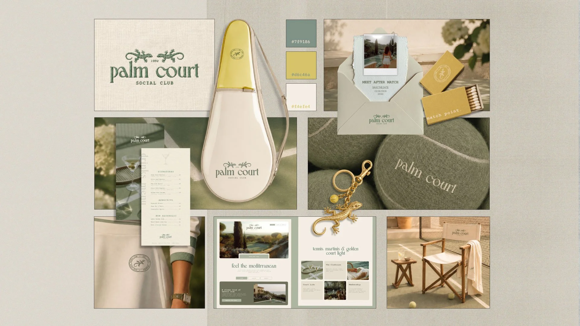
A cohesive identity should work across print, digital and real-world touchpoints.
Refinement is where the identity gets stronger
The first visual direction is rarely the final one.
Refinement is where the identity becomes sharper. Details are adjusted, unnecessary elements are removed and the system becomes more intentional.
Sometimes this means simplifying. Sometimes it means adding warmth, contrast or structure. Sometimes it means making sure the identity works just as well on a small social media post as it does on a printed sign or website header.
This stage is not just about making things prettier.
It is about making the identity clearer.
As I wrote in Why Most Brand Design Looks the Same, many brands become forgettable when they rely too heavily on familiar trends. Refinement helps move the identity away from generic references and closer to something that feels specific to the brand.
The final identity should feel effortless
When a brand identity is finished, it should feel natural.
The colours should make sense. The typography should feel aligned. The imagery should support the mood. The layouts should feel consistent. The details should feel connected.
A good identity does not need to explain itself too much.
It simply feels right.
But that effortless feeling comes from many decisions behind the scenes. Research, concept, art direction, design development, testing and refinement all shape the final result.
From the outside, people may see a logo, a colour palette or a set of mockups.
But what they actually remember is the feeling of the brand as a whole.
A strong brand identity is built, not decorated
Brand identity design is not about adding visual elements until something looks finished.
It is about building a clear world around a brand.
Every decision should support the same direction. The concept, the logo, the typography, the colours, the imagery and the applications all need to work together.
That is how a brand identity becomes more than a design.
It becomes recognisable.
It becomes usable.
It becomes memorable.
And most importantly, it starts to feel like it belongs to the brand itself.
Ready to build a brand identity with direction?
If you are creating a brand and want it to feel clear, cohesive and visually memorable, a considered design process can make all the difference.
[ brand identity services ] [ get in touch ]