
What Makes a Strong Brand Identity Beyond Just a Logo
A strong brand identity is more than a logo. It is the visual system that helps your business look recognisable, professional and consistent across every place people find you.
Many businesses start by asking for logo design, but what they often need is a clearer visual direction. A logo can identify your brand, but a full brand identity shows people how your brand feels, how it communicates and how it should appear across your website, social media, printed materials and everyday content.
If you are still deciding who to work with, you might also want to read How to Choose a Brand Designer Without Wasting Money.
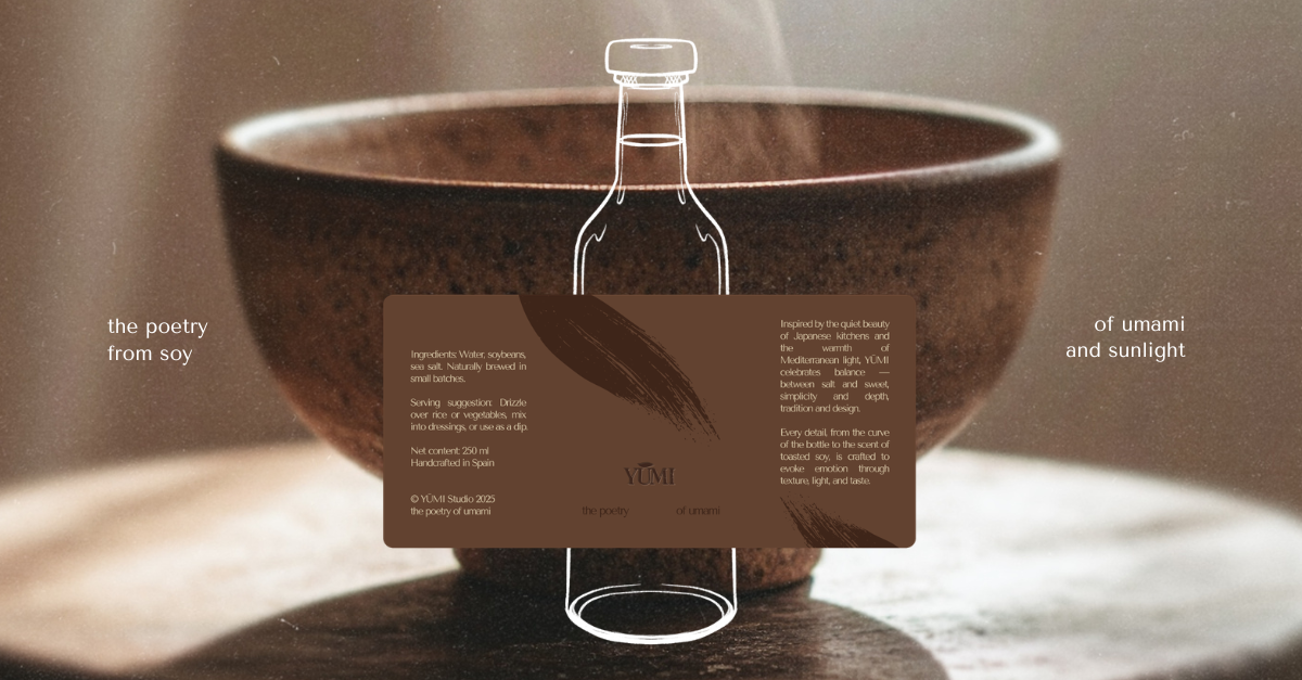
[ 01 ] A strong brand identity starts with clear direction
Before any logo, colour palette or typography system is created, a brand needs direction. This means understanding what your business offers, who it is speaking to and how it should be perceived.
A strong brand identity should support your positioning. It should make your business easier to understand and help the right people recognise whether your brand is for them. Without that direction, design can quickly become decorative rather than useful.
This is where a brand designer or graphic designer should do more than make things look good. The design should create a clear visual foundation that reflects your business, your audience and the feeling you want your brand to leave behind.
[ 02 ] Your logo is only one part of the system
A logo is important, but it is not the full brand identity. A strong visual identity usually includes a logo suite, colour palette, typography system, layout direction, image style and guidance on how everything should work together.
Your logo might appear on your website, packaging, business cards, social media profile, printed materials or signage. It needs to be flexible enough to work in different formats while still feeling recognisable.
Good logo design gives your brand a clear mark. Good brand identity design gives you a complete system around it.
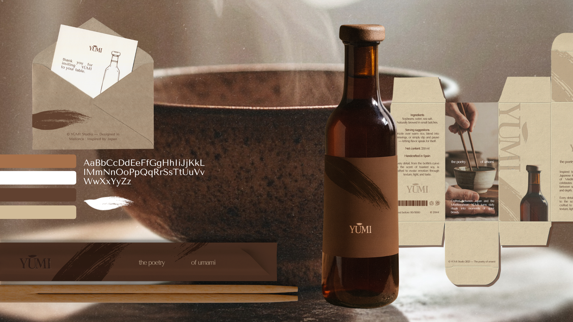
[ 03 ] Colour and typography create recognition
Colour and typography are not just aesthetic choices. They are two of the strongest tools for making a brand feel familiar and recognisable over time.
Your brand colours can influence whether your business feels warm, premium, playful, calm, bold or refined. Your typography can make your brand feel editorial, modern, traditional, expressive or minimal. When these choices are used consistently, people begin to connect them with your brand.
This is why a strong brand identity needs more than a nice colour palette. It needs a system that shows how those colours and fonts should be used across digital and printed touchpoints.
[ 04 ] Imagery, layout and tone make the brand feel complete
A brand identity becomes much stronger when the visual world around the logo is considered. Photography, illustrations, textures, layouts, spacing, social media graphics and website visuals all shape how people experience your brand.
This is often where brands start to feel inconsistent. One post looks minimal, the next feels playful, the website uses different colours and the printed materials follow another direction completely. Even if each piece looks fine on its own, the brand can feel unclear as a whole.
A strong visual identity creates a shared direction for all of these elements. It helps every piece of design feel connected, from a campaign graphic to a menu, packaging label, Instagram post or homepage layout.
[ 05 ] A strong brand identity works across every touchpoint
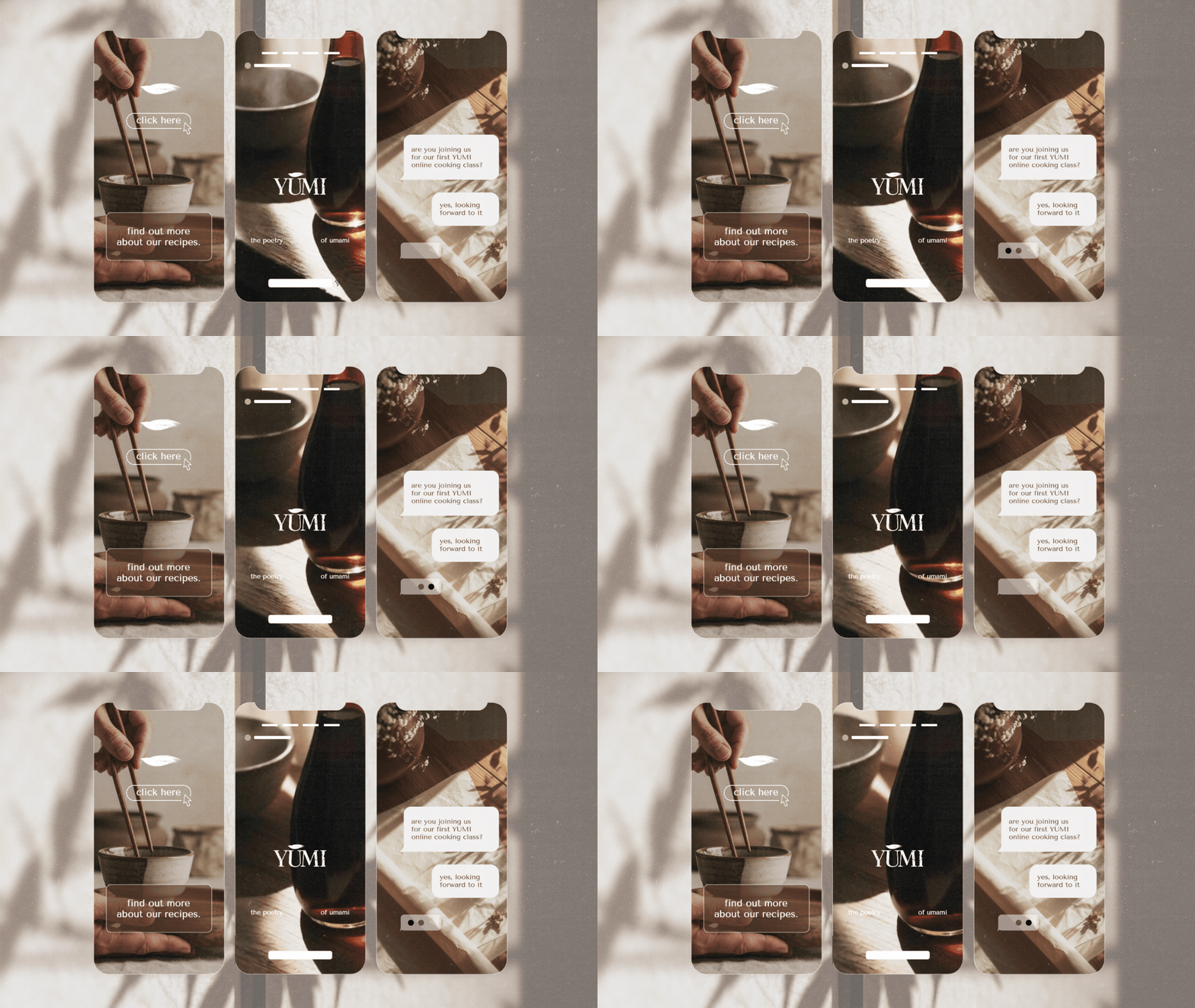
Your brand does not only live in one place. People may discover it through your website, Instagram profile, Google listing, packaging, business card, menu, flyer, email, signage or digital campaign. You can see how this works across different formats in my selected work.
A strong brand identity should work across all of these touchpoints. It should be flexible enough to adapt, but clear enough to stay recognisable. This is what makes a brand feel professional instead of improvised.
When the visual system is strong, every touchpoint supports the same impression. Your website does not feel disconnected from your social media. Your printed materials do not feel like a separate brand. Your content becomes easier to create because there is already a direction to follow.
[ 06 ] The best brand identities are easy to maintain
A good brand identity should make future design decisions easier, not harder. Once the visual direction is clear, it becomes much simpler to create new content, update your website, design printed materials or prepare campaign graphics.
This is why brand guidelines, templates and ongoing creative support can be so valuable. They help keep the brand consistent over time, especially when different people are creating content or when the business continues to grow.
A strong brand identity gives your business a foundation. It should not feel restrictive, but it should give enough structure to keep your visual presence clear, recognisable and easy to manage.
Need a brand identity that works beyond the logo?
mllx studio creates brand identities, visual direction, website visuals and ongoing creative support for brands that want a clearer and more cohesive presence across digital and physical touchpoints.
If your business needs more than a logo, the right visual system can help your brand feel more recognisable, more professional and easier to maintain over time.