
What Does a Professional Brand Identity Package Include?
Two branding proposals can look similar at first glance. Both may mention a logo, colour palette and typography, yet the price, process and final result can differ significantly.
The reason is that a professional brand identity package is not simply a collection of design files. It is a system built to help a business present itself clearly and consistently across the places where customers encounter it.
Exactly what is included will vary depending on the designer, the scope of the project and the needs of the business. A small service-based company may require a very different set of assets from a product brand preparing to launch packaging, retail materials and an online store.
Still, most professional brand identity projects are built around several core components. Understanding them makes it much easier to compare proposals and decide what your business genuinely needs.
1. Brand strategy and creative direction
Before deciding what a brand should look like, there needs to be some clarity around what it should communicate.
The strategic depth of a project can vary. Not every business needs an extensive research document or weeks of workshops. However, the visual direction should still be grounded in an understanding of the company, its audience, its market and where it wants to go.
This stage may explore areas such as:
the purpose and positioning of the business
the audience it wants to attract
its personality and values
competitors and category expectations
how the brand should be perceived
the practical goals of the project
Strategy provides the foundation. Creative direction turns that foundation into a visual point of view.
It helps determine whether the identity should feel warm or precise, understated or expressive, traditional or contemporary. Without that clarity, design choices can easily become a collection of personal preferences rather than a coherent response to the business.
A more expensive branding proposal may therefore include considerably more thinking before any logo concepts are presented. That work is often less visible than the final design, but it influences every decision that follows.
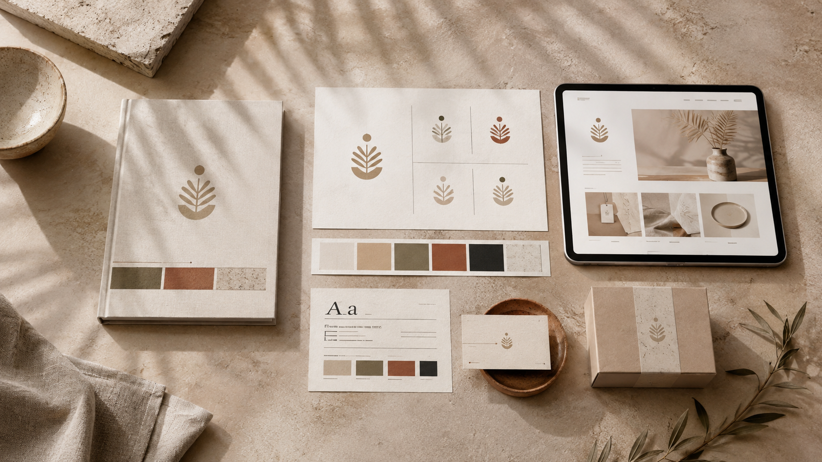
A professional identity brings strategy, visual direction and practical applications into one connected system.
2. A flexible logo system
The logo may be the most recognisable part of a visual identity, but a professional package will usually include more than one fixed version.
A logo that works beautifully across the top of a website may become unreadable as a small social profile image. A detailed wordmark may not fit comfortably on packaging, signage or narrow digital layouts.
For that reason, a logo system may include:
a primary logo
a secondary or alternative arrangement
a compact mark, monogram or symbol
horizontal and stacked versions
light and dark variations
single-colour versions
versions suitable for small-scale use
This does not mean that every brand needs ten different logos. Too many options can make an identity harder to manage rather than more flexible.
The purpose of a logo system is to provide the versions the business will realistically need while ensuring that they still feel like parts of the same identity.
When comparing proposals, it is worth looking beyond whether a “logo” is included and asking what formats and variations will be supplied.
3. A considered colour palette
A professional colour palette is more than a row of attractive shades.
The colours need to work together across different contexts and support the personality of the brand. They should also remain practical when used for text, backgrounds, digital interfaces, print materials or packaging.
A brand identity package may include:
primary brand colours
supporting or secondary colours
neutral background tones
recommended colour combinations
guidance on balance and proportion
HEX, RGB, CMYK and sometimes Pantone values
The colour specifications matter because the same shade is reproduced differently on a screen and in print. A designer should therefore provide the relevant values for the ways in which the brand will be used.
Good colour guidance also helps prevent the identity from becoming inconsistent after handover. Without it, teams may begin introducing slightly different shades or using every colour equally, even when the system was designed around a clear hierarchy.
4. A typography system
Typography has a significant effect on how a brand feels, yet it is often reduced to a list of one or two font names.
A useful typography system explains how those typefaces should work together.
This may include:
a primary display or heading typeface
a body-copy typeface
supporting styles for captions or labels
recommended weights and sizes
hierarchy between headings and paragraphs
spacing and alignment principles
digital and print alternatives where required
A well-defined type system makes it easier to maintain consistency across websites, presentations, social content and printed materials.
Font licensing should also be considered. Some typefaces are free for commercial use, while others require desktop, web or app licences. These costs may or may not be included in the project fee, so they should be clarified before the final handover.
The objective is not simply to choose beautiful typography. It is to create a system that remains legible, recognisable and manageable in everyday use.
5. Art direction and visual language
A logo, colour palette and type system can all be technically correct while the wider brand still feels fragmented.
Art direction defines the visual world around those elements. It shapes how the identity appears when it moves beyond the logo and begins to live across photography, layouts, materials and content.
Depending on the project, this may include guidance for:
photography and image selection
lighting and composition
graphic shapes or framing devices
textures and materials
illustration style
image treatments or colour grading
layout and spacing
motion or animation principles
This is often where a brand becomes more distinctive.
Two businesses can use similar colours and typefaces yet feel completely different because their imagery, compositions and material choices have been directed with a specific point of view.
Without art direction, future designs may still look polished individually but fail to belong to the same recognisable world.

The strongest identities create a recognisable visual world beyond the logo itself.
6. Brand guidelines
Once the visual system has been created, the brand needs clear instructions for using it.
Brand guidelines can range from a concise document covering the essentials to a detailed manual designed for larger teams and external partners. The right length depends on the complexity of the identity and the number of people who will work with it.
Guidelines may cover:
logo versions and usage
clear space and minimum size
incorrect logo applications
colour values and combinations
typography and hierarchy
photography and art direction
layout examples
tone of voice, where included
examples across key touchpoints
The purpose is not to create the longest document possible. A 100-page guide is not automatically more valuable than a shorter one that people can understand and use confidently.
Good guidelines reduce guesswork. They help the business stay consistent after the project has ended, even when new assets are created by different designers, developers, printers or internal team members.
7. Practical brand applications
Rather than designing every item a business could ever need, a professional package should usually focus on the touchpoints that matter most at the time of launch or rebrand.
These may include:
business cards and stationery
presentations or proposal templates
packaging
menus
signage
social media templates
email signatures
advertising materials
website art direction
printed collateral
Applications are also useful during the design process because they reveal whether the system works in reality.
A logo may look strong on a blank page but struggle when placed on a small label. A colour palette may feel balanced in a presentation but become difficult to use across a website. Testing the identity on relevant touchpoints helps identify those issues before handover.
Not every package needs to contain every application. The most useful ones are those the business will genuinely use.
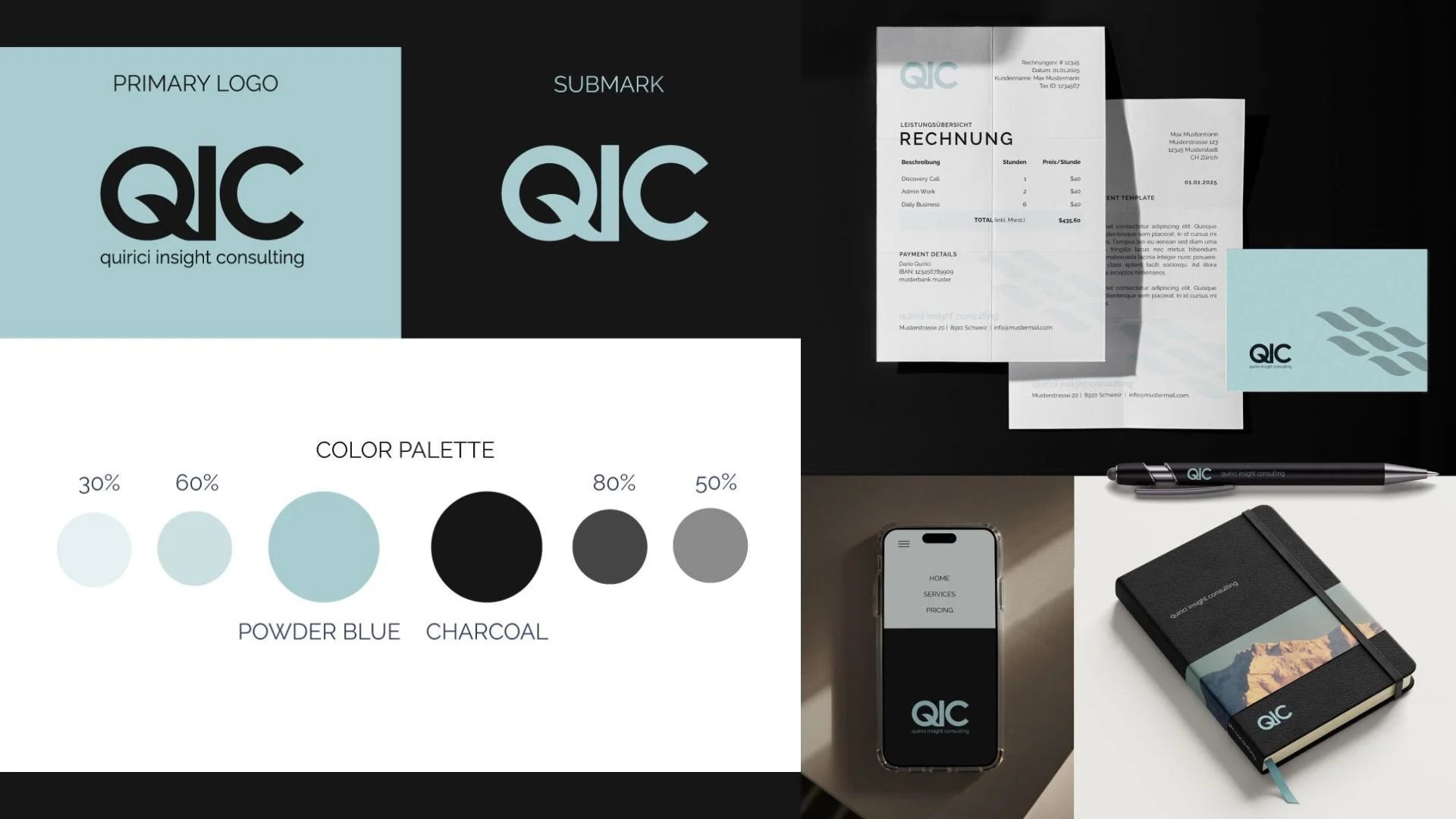
A professional brand identity package should provide a flexible system that works across both digital and physical touchpoints.
8. Final files and handover
The final handover is one of the most practical parts of a brand identity package, yet it is often overlooked when proposals are compared.
A professional designer should provide the files needed for the agreed applications in clearly organised folders.
These may include:
SVG files for scalable digital use
EPS or print-ready PDF files
transparent PNG files
JPG files for standard use
RGB versions for screens
CMYK versions for print
colour and font information
brand guidelines
editable templates where agreed
The exact formats will depend on the project.
Editable working files are not automatically included by every designer. Some studios provide them, while others supply final production-ready assets and retain the original working files. Neither approach is necessarily wrong, but it should be clear in the proposal.
The handover should leave the client knowing which file to use and where, rather than receiving a confusing folder filled with unexplained variations.
9. Launch assets and implementation support
A brand identity is only useful when it can be introduced successfully.
Some packages therefore include launch assets or support with the first stage of implementation. Others offer these as additional services once the core identity has been approved.
This may include:
social media launch graphics
profile and cover images
website assets
packaging or print coordination
presentation templates
developer handover
launch campaign materials
post-launch design support
This is particularly useful for businesses without an internal creative team.
A complete identity can quickly lose coherence if the first public-facing assets are created without reference to the system. Implementation support helps bridge the gap between approving a brand presentation and actually using the identity in daily business.
When comparing proposals, it is worth checking whether the project ends with the delivery of logo files or includes support for bringing the identity into the world.
What should your brand identity package include?
There is no single package that is right for every business.
A new service business may need a clear identity, presentation template and website direction. A beauty or food brand may require packaging, print specifications and retail applications. An established company undergoing a rebrand may need a more extensive strategy phase and support rolling the new system out across existing touchpoints.
The right scope depends on factors such as:
the stage and size of the business
whether it is a new identity or a rebrand
the number of products or services
the internal team and available resources
immediate launch requirements
the number of physical and digital touchpoints
the budget available for implementation
A proposal with more deliverables is not automatically the better proposal.
The most valuable package is the one that solves the real communication problems of the business and provides the tools required to use the identity consistently afterward.
Before comparing prices, it helps to ask whether each proposal includes the same level of strategy, flexibility, guidance and implementation.
A good brand identity package should make the business easier to present
The value of professional brand identity design is not measured by how many logo files or mockups are delivered.
It lies in whether the final system makes the business clearer, more recognisable and easier to present across the places where it needs to appear.
A strong package should give the client more than a polished launch moment. It should provide a practical foundation for future websites, campaigns, packaging, content and materials without requiring the visual direction to be reinvented every time.
That may mean a focused identity with only a few essential applications, or a more extensive system built for a business with multiple products and touchpoints. The scope should follow the needs of the company rather than a generic list of deliverables.
At mllx studio, I create strategic brand identities shaped around the personality, direction and real-world needs of each business.